
The Importance of Color in a Website
Color is an essential element of web design that greatly impacts the overall user experience. It has the power to evoke emotions, create a visual hierarchy, and communicate brand identity. When used effectively, color can enhance a website’s aesthetics, improve readability, and ultimately drive user engagement.
 Incorporating color into a website requires careful consideration of various factors such as target audience, brand personality, and the intended purpose of the website. Understanding the psychology behind colors is crucial in making informed design decisions. Different colors have different meanings and associations, and they can elicit specific emotional responses from users.
For instance, warm colors like red and orange tend to evoke feelings of excitement, passion, and energy. These colors can be used to draw attention to important elements on a website or to create a sense of urgency. On the other hand, cool colors such as blue and green are often associated with calmness, trust, and stability. These colors are commonly used in websites that aim to promote relaxation or convey a sense of security.
The choice of color scheme also plays a significant role in creating a cohesive and visually pleasing website design. A well-chosen color palette can help establish a strong brand identity and make a website more memorable. Consistency in color usage across different elements of a website, such as buttons, links, and backgrounds, can improve user navigation and make the overall design more cohesive.
Additionally, color contrast is crucial for ensuring readability and accessibility. Proper contrast between text and background colors is essential for users with visual impairments or color blindness. It is important to consider accessibility guidelines and ensure that text is easily readable for all users.
What are Your Brand Colors?
If I asked what are your brand colors, could you answer me?
What colors did you choose for your website and do they align with your brand?
Choosing the Correct Color.
Choosing the right color scheme is important, and not just because it looks nice.
If I said it helps boost conversions, establish brand identity, and help retain visitors, would you believe me?
Boost Conversion
Having a nice color scheme for your website is similar to painting your house or shop. If you were asked into a bright pink bedroom at the culmination of a lovely night out…what would you think?
 Maybe if you were a male you would think this person is screaming out their desire for building a family….. possibly the wrong choice on a first “date”. Maybe a more neutral color may have got a return approval.
Picking the right color schemes can influence your customers decisions. If important elements like CTA’s or call to action stand out (not hot pink, unless you’re Barbie), visitors are more likely to interact with them.
For example, a study shows that RED works better for a CTA button than green.

60-30-10 Color Rule.
In one of my past lives, I used to be a very successful printer. With a website, the “rule” used to be 1 color scheme with 60% being the dominant color 30% being the secondary color and 10 % being the accent color.
Knowing the Right Colors
Implementing the right website colors can improve your user’s experience. Combined with a well-designed user interface colors can help visitors navigate your site.
And we know how much Google likes that.
There is so much more about color that you should look at. And if you aren’t a printer or designer it could be something you need to outsource.
Color my world with a smile and I will go that extra mile.
The Psychology of Color in Web Design.
A.I Color Generators.
To further enhance the user experience on my blog, I have also made use of AI color generators. These tools have been incredibly helpful in exploring different color combinations and finding inspiration for my website design.
AI color generators use algorithms to analyze color trends and create harmonious color palettes that are visually appealing. They can suggest complementary colors, analogous colors, or even monochromatic schemes based on a chosen base color.

Some popular AI color generators include “Coolors“, Adobe Color CC, and “Paletton“. These tools allow designers to experiment with different color combinations in real-time, making it easier to find the perfect colors for their websites.
Whether you’re looking for a bold and vibrant palette or a soft and muted scheme, AI color generators can provide valuable insights and help streamline the design process.
 Another Example of a Website that uses AI Color Generators.
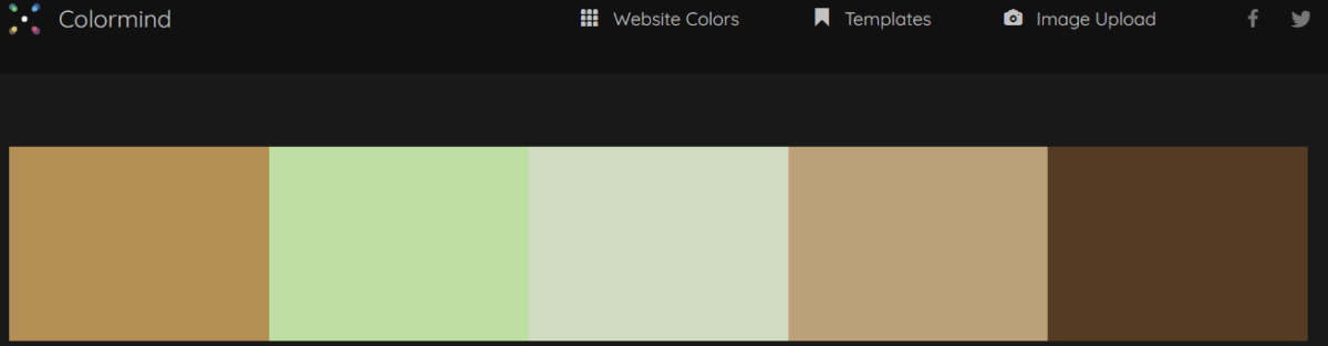
One more of these websites is Colormind. which is a color scheme generator that uses deep learning.
It can learn color styles from photographs, movies, and popular art. Different datasets are loaded each day, so you can get different color inspirations every time you visit the website.
You can also lock some colors and let the AI generate the rest of the palette for you. It’s a very useful and creative tool for web design.
 Final Thoughts
In conclusion, color is an integral part of web design that can greatly impact the overall user experience. By understanding the psychology behind colors and considering accessibility guidelines, and utilizing AI color generators, we can create visually appealing websites that effectively communicate brand identity and engage users.
So next time you’re designing a website, remember the importance of color and the impact it can have on your audience.
Steve Hey

Some links on this site may be affiliate links, and if you purchase something through these links, I will make a commission on them. There will be no extra cost to you and, you could actually save money. Read our full affiliate disclosure here.
